How to Make Captions Look Professional (Color, Font, Size, Position)
Make captions look professional in 2026. Color, font, size, and position best practices from Netflix, BBC, and W3C — applied to short-form social video.

Professional captions use bold sans-serif fonts (Montserrat, Anton, Poppins), white or yellow text, 3–4px black stroke treatment, 7–10% frame height size, center-bottom positioning, and 3–7 seconds display per block. These specifications come from Netflix, BBC, and W3C accessibility standards adapted for the 9:16 vertical video format. The result is captions that are readable in 1–2 seconds, accessible on any background, and visually clean on mobile.
Unprofessional captions share common failures: font too small, no background treatment, text in the UI danger zone, or color choices that disappear on half the backgrounds in the video. This guide fixes all of them.
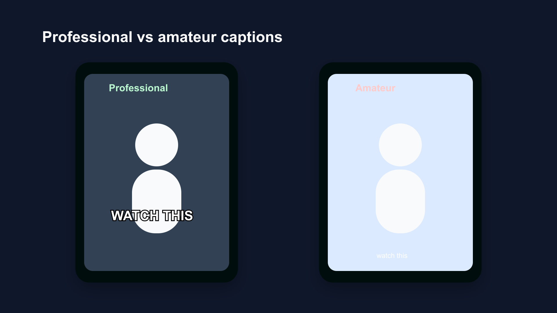
Professional captions (left): bold sans-serif, white with outline, center-bottom safe zone, consistent size. Amateur captions (right): thin font, no treatment, too small, too close to bottom UI.
Why Most Captions Look Amateur
Amateurish captions have four consistent problems:
1. Font too small. Default sizes in most apps are conservative. What looks fine on a desktop preview is unreadable on a phone held at arm's length.
2. No contrast treatment. White text alone on a video background becomes invisible when the background goes light — a white wall, a window, outdoor footage. No outline, no background box, no shadow.
3. Wrong position. Text placed at the very bottom of the frame gets covered by the subscribe button on YouTube Shorts, the username on Reels, or the navigation bar on TikTok.
4. Inconsistent style. Caption size, color, or font changes mid-video, or captions appear on some clips but not others.
Professional captions avoid all four by following a consistent system.
1. Font: Bold Sans-Serif Only
What Works
Bold, condensed, or regular-width sans-serif fonts are the standard for professional captions. The characteristics that make them work:
- High x-height: Lowercase letters are large relative to uppercase, improving readability at small sizes
- Consistent stroke width: No thick-to-thin variation (contrast) that creates visual noise on video
- Clear letterform differentiation: Each character is distinct at a glance — critical when display time is 1–3 seconds
Recommended fonts:
| Font | Weight | Best For |
|---|---|---|
| Montserrat | Bold | All-purpose, educational, lifestyle |
| Anton | Regular (already heavy) | High-energy, fitness, motivation |
| Poppins | Bold | Beauty, wellness, approachable brands |
| League Spartan | Bold | Business, branded content |
| Open Sans | Bold | Accessibility-first, educational |
What Doesn't Work
- Script and handwriting fonts: Variable stroke width, low legibility at speed
- Serif fonts: Serifs create visual noise on video backgrounds; designed for long-form print reading
- Light or thin weights: Disappear on complex backgrounds regardless of color
- All-caps decorative fonts: Acceptable for single-word emphasis, not for caption streams
2. Color: White as Default, Yellow as Secondary
White
White is the standard caption color across Netflix, YouTube, BBC, and the broadcast industry. White on a dark background achieves maximum contrast. With a black stroke treatment, white text remains readable on both dark and light backgrounds.
Use white for: All talking-head content, any content with predominantly dark backgrounds, professional and educational content.
Yellow
Yellow (specifically bright yellow, not gold or amber) has been used in broadcast subtitling for decades. It achieves strong contrast on dark backgrounds and is historically used to distinguish foreign-language dialogue from same-language dialogue in film.
On social video, yellow reads as high-energy. It's appropriate for content that matches that tone.
Use yellow for: Fitness content, motivational Reels, high-energy Shorts, content styled after sports or action genres.
Colors to Avoid
| Color | Why to Avoid |
|---|---|
| Red | Fails WCAG contrast requirements on both dark and light backgrounds; associated with warnings |
| Green | Poor contrast on natural and outdoor backgrounds; associated with data/tech, may confuse visual hierarchy |
| Blue | Fails on blue-sky backgrounds; low contrast on dark blue video |
| Pink / Pastel | Insufficient luminance contrast on any but the darkest backgrounds |
| Dark gray | Falls below 4.5:1 contrast ratio on medium backgrounds |
The W3C WCAG rule: Text must achieve a 4.5:1 contrast ratio against its background (AA standard) or 7:1 (AAA). White on black achieves 21:1. Yellow on dark backgrounds achieves 12–15:1. Most other colors fall short.
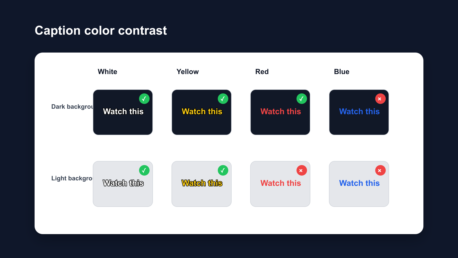
Caption color performance on dark background (top row) and light background (bottom row). White and yellow maintain readability in both conditions with outline treatment. Red and blue fail on specific backgrounds.
3. Treatment: Outline First, Shadow Second
The Hierarchy
Professional caption treatment follows a reliability hierarchy:
Background box (most reliable): White text on a semi-transparent black box. Used by Netflix and BBC as the default. Contrast ratio: 21:1. Guaranteed readability on any background.
Outline/stroke (reliable for social video): 3–4px black stroke around white text. Contrast ratio: approximately 12:1 on average backgrounds. Works on most video backgrounds. Standard for TikTok, Reels, and Shorts.
Drop shadow (supplement only): Not reliable as a standalone treatment. Fails on light backgrounds. Add as a secondary layer under an outline to improve depth, not as the primary contrast mechanism.
Practical Settings
For social video (Shorts, Reels, TikTok):
- Primary: 3–4px black stroke on white text
- Supplement: Soft drop shadow (2–3px offset, 30–50% opacity)
For streaming / long-form:
- Primary: White text on 70–80% opacity black background box
For accessibility-critical content:
- Primary: White text on 100% opacity black background box (21:1 contrast ratio)
Full breakdown: Caption Background vs Outline vs Shadow
4. Size: 7–10% of Frame Height
The Standards
Professional captioning organizations define size as a percentage of frame height — not as a point size — because video is displayed at many physical sizes.
BBC: Font at approximately 8% of frame height (derived from broadcast Teletext standard).
Netflix: Maximum 42 characters per line; text fills approximately the bottom fifth of the frame.
Social video: 7–10% of frame height is the practical range for 9:16 Shorts/Reels/TikTok.
Converting to Pixel Values
At 1080×1920 (standard social video resolution):
| % Frame Height | Pixel Height | Approx. Font Size |
|---|---|---|
| 5% | 96px | ~36pt (too small) |
| 7% | 134px | ~48pt (minimum) |
| 8% | 154px | ~54pt (sweet spot) |
| 10% | 192px | ~68pt (maximum standard) |
| 12% | 230px | Too large for most content |
Rule: Never go below 7% for primary caption text. Never exceed 10% unless the entire frame is designed around large caption display.
Line Length
Netflix standard: Maximum 42 characters per line. BBC standard: 37 fixed characters (broadcast), 68% of 16:9 frame width (online).
For 9:16 social video: 35–42 characters per line, keeping text width to 80–85% of frame width. This leaves visible margin on each side and keeps text clear of the safe zone edges.
Captions that run edge-to-edge across the frame look cramped and are harder to read at a glance.
5. Position: Center-Bottom, Above the UI
The Safe Zone
Every platform places interactive UI elements over the video. Captions placed in these zones get covered:
| Platform | Danger Zone | Safe Caption Zone |
|---|---|---|
| YouTube Shorts | Bottom 20%, right edge | 55–78% down from top |
| Instagram Reels | Bottom 35%, right edge | 45–68% down from top |
| TikTok | Bottom 25%, right edge | 50–73% down from top |
General rule: Keep captions in the center horizontal span of the frame, between 50–75% down from the top of the 1920px height.
Vertical Positioning
Don't center vertically. Center-screen captions cover the speaker's face. Place captions in the lower half — above the UI zone but below the speaker's chin.
Don't go to the very bottom. Bottom 20–35% is covered by platform UI depending on the platform. Always leave this zone empty.
The target zone: 55–75% down from the top of the frame on most platforms. This clears the speaker's face, stays above the UI, and keeps captions in the viewer's natural reading zone.
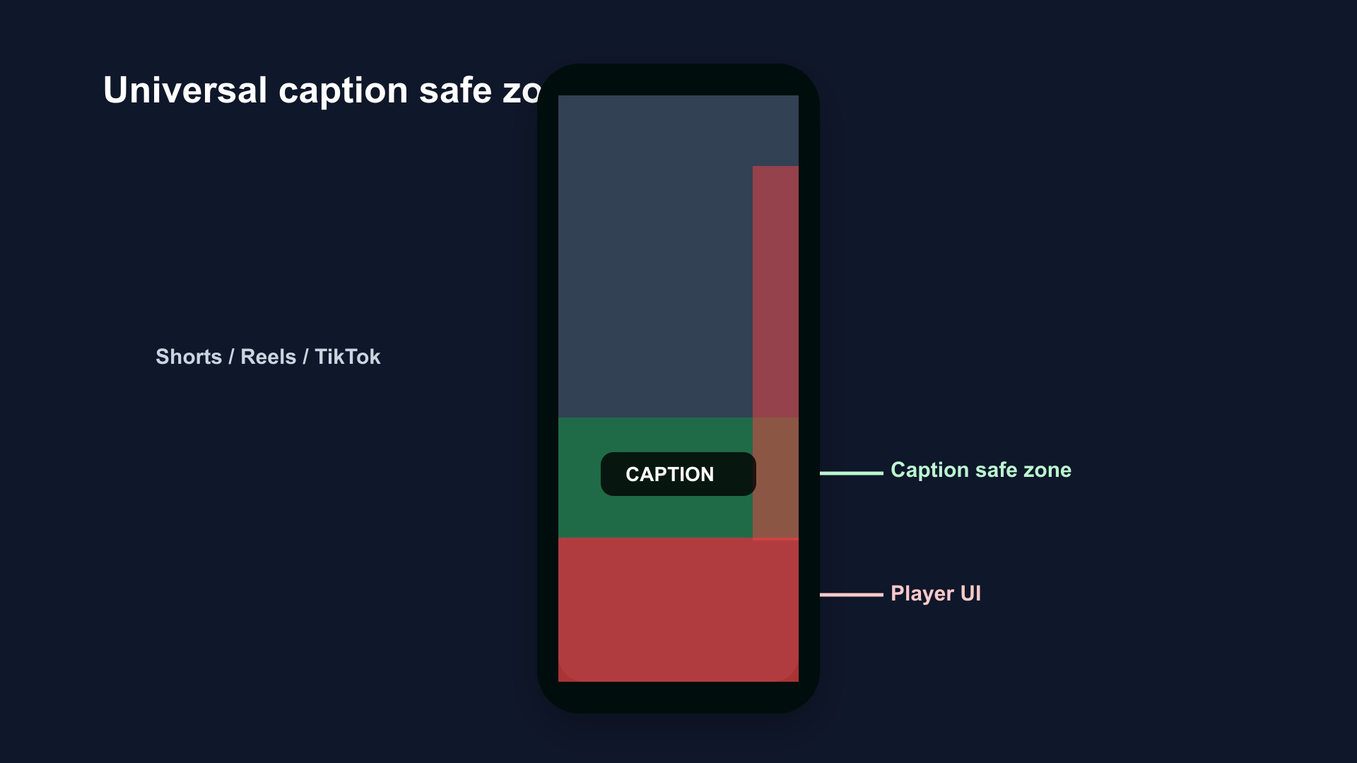
Caption safe zone for all three platforms. Green zone: safe for captions. Red zone: covered by platform UI. The safe zone starts at approximately 55% from top and ends at 75–80%, platform-dependent.
6. Timing: Display Duration and Reading Speed
Duration Per Caption Block
Netflix standard: Minimum 5/6 second per subtitle, maximum 7 seconds. BBC standard: Minimum 1 second, maximum 7 seconds.
For social video:
- Minimum: 1.5 seconds (below this, even a single word is hard to register)
- Maximum: 5–6 seconds (longer feels stale as the speaker has moved on)
- Sweet spot: 2–4 seconds per caption block
Reading Speed
Netflix standard: 20 characters/second for adults, 17 for children. BBC standard: 17 characters/second.
At 20 characters/second, a 42-character line (Netflix's maximum) takes 2.1 seconds to read. This sets the minimum display duration for a full-length caption.
Do not display captions faster than 20 characters/second. Viewers cannot read them. They stop reading. Captions that can't be read are worse than no captions — they're distracting visual noise.
7. The Complete Professional Caption Spec
| Element | Value |
|---|---|
| Font | Montserrat Bold, Anton, Poppins Bold, or equivalent bold sans-serif |
| Color | White (default); yellow (high-energy content) |
| Treatment | 3–4px black stroke; optional soft shadow at 30–50% opacity |
| Size | 7–10% of frame height (~48–68pt at 1080p) |
| Max chars/line | 42 (Netflix) |
| Line length | 80–85% of frame width |
| Display duration | 1.5–6 seconds per block |
| Reading speed | Max 20 characters/second |
| Position | Horizontal center, 55–75% down from top |
| Contrast ratio | Minimum 4.5:1 (WCAG AA); target 7:1+ (WCAG AAA) |
How to Apply This in BlitzCut
BlitzCut generates AI captions with pre-built styles based on these specifications. The default styles ship with:
- Bold sans-serif fonts at 7–9% frame height
- White fill with black stroke treatment
- Positioned in the platform safe zone automatically
- Word-by-word and block formats available
- Export in 9:16 ready for Shorts, Reels, and TikTok
No manual size calculations, no position guessing, no contrast ratio math. Import footage, tap Subtitles, choose a style, export.
Frequently Asked Questions
What makes video captions look professional?
Bold sans-serif font (Montserrat Bold, Anton), white text with a 3–4px black outline, sized at 7–10% of frame height, positioned center-bottom above the platform UI zone, and displayed for 2–4 seconds per block at a maximum 20 characters per second reading speed.
What font size should video captions be?
7–10% of frame height. At 1080×1920 resolution (standard for Shorts, Reels, TikTok), that's approximately 48–68pt. Below 7% is too small to read on mobile. Above 10% covers too much of the video frame.
What contrast ratio do professional captions need?
W3C WCAG AA standard: 4.5:1. WCAG AAA: 7:1. White on a black background box achieves 21:1. White with a 4px black stroke achieves approximately 12:1 on most video backgrounds. Drop shadow alone often falls below 4.5:1 on light backgrounds.
What do Netflix and BBC use for captions?
Both default to white text on a semi-transparent black background box. Netflix maximum: 42 characters per line, 7 seconds per subtitle. BBC: 37 characters (broadcast standard), 8% of frame height.
Where should captions be positioned on vertical video?
Center of frame horizontally, 55–75% down from the top of the frame. This keeps captions above the platform UI (bottom 20–35% is covered by subscribe buttons, usernames, and navigation bars) while staying below the speaker's face.
How long should each caption stay on screen?
1.5–6 seconds per caption block. A maximum reading speed of 20 characters/second means a 42-character caption needs at least 2.1 seconds on screen. Under 1.5 seconds is too fast to read. Over 6 seconds feels stale relative to the spoken content.
Related Guides
- Caption Background vs Outline vs Shadow: Which Is More Readable — treatment deep-dive
- Best Caption Font for Instagram Reels (2026) — Reels font guide
- Best Caption Style for YouTube Shorts (2026) — Shorts style guide
- Best Caption Colors for TikTok — color selection
- Best Caption Size for TikTok (2026) — size guide for TikTok
- Best Caption Placement for Short-Form Video — placement guide
- Word-by-Word vs Full-Sentence Captions — format comparison
- Safe Zone Guide for YouTube Shorts, Reels & TikTok — platform UI zones
Post every day without spending hours editing
BlitzCut is a native App Store app for iPhone, iPad and on Mac. Get from raw footage to TikTok-ready in under 2 minutes, so editing is never the reason you didn't post.
Download BlitzCut on the App StoreRelated Articles
Keep Reading

Does CapCut Work on Mac? (2026 Guide + Alternatives That Work Better)
CapCut has a Mac desktop app in 2026, but with real limitations. Here's what works, what doesn't, and the Mac-native alternatives creators are using instead.

Instagram Edits App 2026: What It Is for Reels Creators
Instagram Edits is Meta's standalone video editor for Reels creators. See how it compares to CapCut and BlitzCut, and whether it's worth using in 2026.

How to Post Every Day Without Burning Out (2026 Creator Workflow)
Most creators burn out because they lack a system, not willpower. Batch recording and AI editing let you post daily without it becoming a second job.