Best Caption Placement for Short-Form Video (Where to Put Subtitles)
Caption placement for TikTok, Reels, and YouTube Shorts: exact safe zone measurements, UI dead zones per platform, and the face-overlap question answered.

Caption placement is the most commonly ignored caption variable and the one that causes the most visible mistakes. A perfectly sized, well-colored caption that sits under TikTok's like button is a caption no one reads. A caption that overlaps TikTok's username row gets cut off on every device. A caption in the upper third of the frame is technically readable but visually wrong — it fights with the platform chrome.
This guide covers exact safe zone measurements for TikTok, Instagram Reels, and YouTube Shorts, the specific dead zones each platform imposes, and where to place captions for maximum readability without UI overlap.
The Quick Reference: Caption Placement Safe Zones
TikTok (1080×1920)
| Area | Dead zone size | Why |
|---|---|---|
| Top | 130px from top | Following/For You tab, profile overlays |
| Bottom | 320–350px from bottom | Caption text, audio attribution, sound bar |
| Right edge | 120–164px from right | Like, comment, share, bookmark column |
| Left edge | 60px from left | Minimal — username/avatar at bottom-left |
| Usable safe zone | ~960×1386px centered | Clear of all fixed UI elements |
As of January 2026, TikTok added an "Add to Playlist" button at bottom-right, expanding the right dead zone by approximately 20px.
Instagram Reels (1080×1920)
| Area | Dead zone size |
|---|---|
| Top | 108–220px from top |
| Bottom | 310–450px from bottom (increased late 2025) |
| Right edge | ~120px from right |
| Usable safe zone | ~900×1440px centered |
Instagram's audio attribution bar expanded in late 2025, adding approximately 50px to the bottom dead zone. If you designed your caption zone before late 2025, recalibrate.
YouTube Shorts (1080×1920)
| Area | Dead zone size |
|---|---|
| Top | ~120px from top |
| Bottom | ~300px from bottom |
| Right edge | ~48px from right |
| Usable safe zone | ~984×1500px centered |
YouTube Shorts has the smallest UI penalty of the three platforms — the right edge dead zone is minimal (48px vs. 120–164px on TikTok). Shorts also expanded the subscribe button in late 2025, adding approximately 30px to the bottom-left area.
Cross-Platform Universal Safe Zone
If you post the same video to TikTok, Reels, and Shorts without re-editing:
Keep all caption text within a 900×1400px centered rectangle in the 1080×1920 frame.
This accounts for the most restrictive dead zones across all three platforms simultaneously.
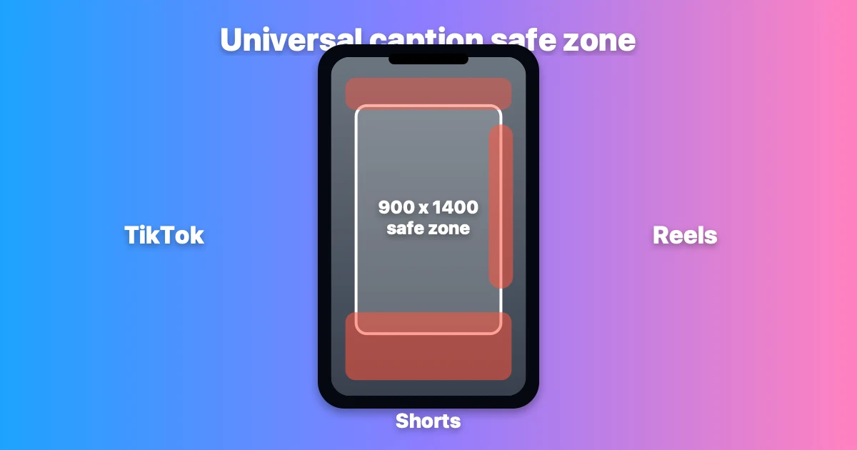
The cross-platform safe zone (center white box) clears TikTok's 164px right-side button column, Reels' expanded bottom strip (up to 450px), and Shorts' subscribe area. Design captions inside this box and they'll display clean on all three platforms without re-editing.
Where Captions Perform Best: The Lower-Middle Third
The consensus from platform best practice documentation, creator guides, and tool vendor research is consistent: captions belong in the lower-middle third of the usable safe zone, not at the absolute bottom.
What "lower-middle third" means in practice at 1080×1920:
- Start caption block at approximately Y position 1200–1300px from top (below the midpoint of the frame)
- End caption block no lower than 370px from bottom (safely above the dead zone)
- This places captions between roughly Y=1200 and Y=1550 on the 1920px vertical axis
This positioning has two advantages:
- It clears the platform UI at the bottom — the 320–450px dead zone is avoided with margin
- It reduces eye travel — for talking-head content where the speaker is centered or upper-frame, lower-middle captions are close to the face, which reduces the distance the viewer's eye must travel to read while also watching the speaker
The Right-Edge Dead Zone: The Most Missed Mistake
TikTok's right-side button column (like, comment, share, bookmark, and the new playlist button) eats 120–164px of the right margin. This is the most commonly missed placement mistake in creator content.
The failure mode: creator uses centered text that reads correctly in their editing software, but the rightmost characters on longer caption lines are behind TikTok's button column. This doesn't show up in the desktop preview — it only appears when the video is playing on TikTok itself.
The fix: Center-align or left-align all caption text within the 900×1386px safe zone, not within the full 1080×1920 frame. In practical terms, this means treating the right 160px of the frame as non-existent when placing captions.
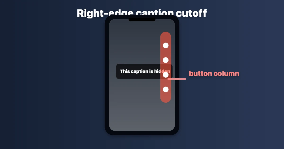
The most common TikTok caption mistake: text placed to the full 1080px width gets cut off behind the right-side engagement buttons. This doesn't appear in desktop editors — it only shows on TikTok itself.
Should Captions Cover the Speaker's Face?
For talking-head content — where the creator is on camera, the face is central, and the human connection is part of the engagement — captions that overlap the eyes or mouth consistently hurt performance.
The reason: viewers engaging with talking-head content are reading expressions as well as words. Covering the speaker's face with a text block breaks the human signal. Multiple creator guides describe this as captions "doing more harm than good" for connection-based content when they cover the face.
Where face and captions intersect: In a typical centered talking-head shot, the face occupies the upper-middle portion of the frame — approximately Y=200 to Y=900 in a standard framing. Lower-middle third captions (Y=1200–1550) generally don't overlap the face unless the speaker is positioned very low in the frame.
When face overlap is acceptable or neutral:
- B-roll or cutaway footage where no face is visible
- Split-screen or multi-person content where the face is not the primary engagement signal
- Fast-cut montage content where captions function more as overlays than transcription
Exception pattern: Some creators intentionally place captions to cross the speaker's chin or lower face as a stylistic choice in hype or entertainment content. This works specifically because it signals unconventional energy — but it requires a deliberate design intention, not an accident of default positioning.
Upper-Third Placement: Why Creators Avoid It
Captions placed in the upper third of the frame are technically readable but feel wrong to most viewers. The reasons:
-
Proximity to platform chrome: TikTok and Reels both display tab bars and profile overlays in the top 130–220px. Captions in the upper third sit close to this UI, which creates visual competition.
-
Reverse reading flow: Viewers are conditioned by decades of media to read subtitles in the lower portion of the frame. Upper-third captions work against this conditioning and add small cognitive friction.
-
Covering the hook: The most important visual moment in a short-form video is the opening shot — the hook. If your captions are upper-third, they may cover the visual hook on frame one, which is also the thumbnail frame.
Upper-third placement is only used intentionally for specific artistic effects, or as a deliberate counter-signal (rare, not recommended as a default).
Platform-Specific Placement Differences
TikTok
The aggressive right-side button column (up to 164px) is TikTok's distinctive placement constraint. No other platform is as restrictive on the right margin. If you design captions for Reels or Shorts first and then apply the same placement to TikTok, the right edge will often be cut off.
Design for TikTok's right-side constraint first, then verify on Reels and Shorts — not the other way around.
Instagram Reels
Reels expanded the bottom dead zone in late 2025 when Instagram updated the audio attribution bar. The new effective bottom dead zone is 310–450px depending on whether audio attribution is displayed. Caption blocks that previously cleared the bottom may now overlap. If you have a caption template from before late 2025, verify it against the current Reels UI.
YouTube Shorts
Shorts has the most generous margins — minimal right-edge dead zone (48px), manageable bottom dead zone (300px). For a creator optimizing captions for Shorts first, the placement will generally be compatible with TikTok and Reels with minor adjustments.
LinkedIn Video (Vertical)
LinkedIn vertical video uses 1080×1920 but has a larger top dead zone (company name, post text appear at top) and smaller right-side penalties. The same 900×1400 centered safe zone applies as a conservative starting point.
Placement for Ads vs. Organic Content
If you run TikTok Ads, the safe zone shrinks further:
| TikTok Ads dead zone | Size |
|---|---|
| Bottom (CTA button + product card) | 370–484px from bottom |
| Right (interaction buttons) | Same as organic (~164px) |
For TikTok Ad creative, captions must clear 370–484px from the bottom instead of the organic 320–350px. The extra dead zone from the CTA button means caption blocks designed for organic content will overlap the ad CTA unless adjusted.
Practical Placement Workflow
Step 1: Set your editing canvas or safe area to 960×1386px centered in the 1080×1920 frame (TikTok-specific). Use 900×1400px if cross-posting.
Step 2: Position the caption block in the lower portion of this safe area — approximately Y=1200 to Y=1550 in the full frame.
Step 3: If your video is talking-head: check that the caption block doesn't overlap the speaker's eyes or mouth in the opening and most common frames.
Step 4: Export, send to your phone, play in TikTok. Confirm no caption text is behind the like/comment/share buttons on the right edge, and confirm no caption is cut off by the bottom bar.
Step 5: If cross-posting to Reels: confirm bottom clearance is still sufficient given Reels' larger bottom dead zone.
How Caption Placement Affects Watch Time
Correct caption placement indirectly affects watch time through two mechanisms:
-
Readability: Captions in the dead zone are unreadable. Viewers who cannot read the captions in a muted-view session lose the ability to follow the content and drop off.
-
Algorithm CTA compliance: For ads, captions that overlap the CTA button reduce click-through rate. Platform-internal data from TikTok suggests proper placement can double CTA click-through rate on ad creative compared to placement that conflicts with the button zone.
For organic content, the mechanism is more indirect: captions that are readable drive watch time, watch time drives distribution, distribution drives reach. The placement is step one in that chain.
Frequently Asked Questions
Where should captions be placed on TikTok? Lower-middle third of the safe zone — approximately Y=1200–1550 in the 1920px vertical axis, clear of the 320–350px bottom dead zone. Horizontally, keep all text within the center 960px to avoid the 120–164px right-side button column.
What is the TikTok safe zone for captions? Approximately 960×1386px centered in the 1080×1920 frame. This accounts for TikTok's top bar (130px), bottom UI (350px), and right-edge button column (164px).
Should captions overlap the speaker's face on TikTok? For talking-head content: no. Covering eyes or mouth breaks the human connection signal that drives engagement in that format. Lower-middle third placement generally avoids face overlap in standard centered framing.
Is the caption placement the same for TikTok, Reels, and YouTube Shorts? Not exactly. The safe zone for cross-posting is 900×1400px centered (the most restrictive common denominator). TikTok is most restrictive on the right edge; Instagram Reels is most restrictive at the bottom. YouTube Shorts has the most generous margins.
Why are my TikTok captions behind the like and share buttons? You're placing captions to the full 1080px width. TikTok's like, comment, share, and bookmark buttons occupy 120–164px on the right edge. Keep caption text within the center 900–960px of the frame to avoid this.
Do I need different caption placement for TikTok ads? Yes. TikTok Ads add a CTA button and product card that push the bottom dead zone to 370–484px from the bottom. Caption blocks designed for organic content (320–350px clearance) will overlap the ad CTA without adjustment.
Related: Best Caption Size for TikTok in 2026 · Best Caption Colors for TikTok · TikTok Caption Trends 2026
Post every day without spending hours editing
BlitzCut is a native App Store app for iPhone, iPad and on Mac. Get from raw footage to TikTok-ready in under 2 minutes, so editing is never the reason you didn't post.
Download BlitzCut on the App StoreRelated Articles
Keep Reading

Best Podcast Clip Makers in 2026 (Honest Comparison)
The best podcast clip makers compared: Opus Clip, Vizard, Riverside, Descript, and BlitzCut — ranked by how you actually clip, with real tradeoffs and pricing.

Best Teleprompter Apps for iPhone in 2026 (Tested)
The best teleprompter apps for iPhone: Teleprompter Premium, PromptSmart Pro, BIGVU, and free options compared — plus the editing step that makes prompter footage watchable.

How to Edit a VSL That Converts (2026 Guide)
How to edit a video sales letter: cut dead air, tighten the script after recording, add captions for muted autoplay, and pace the pitch — with the exact workflow.