Best Caption Font for Instagram Reels (2026)
Best caption fonts for Instagram Reels in 2026. Montserrat, Anton, and Poppins ranked by mobile readability, contrast, and viewer retention.

The best fonts for Instagram Reels captions in 2026 are bold, sans-serif typefaces — Montserrat Bold, Anton, League Spartan, and Poppins Bold are the top choices. 98% of Instagram users watch on mobile, which means fonts must be readable at small sizes on a 6-inch screen in bad lighting. Thin, decorative, or italic fonts fail that test. Bold sans-serif fonts pass it.
This guide covers which fonts work, which fail, what the data says about readability, and how caption style affects completion rate on Reels.
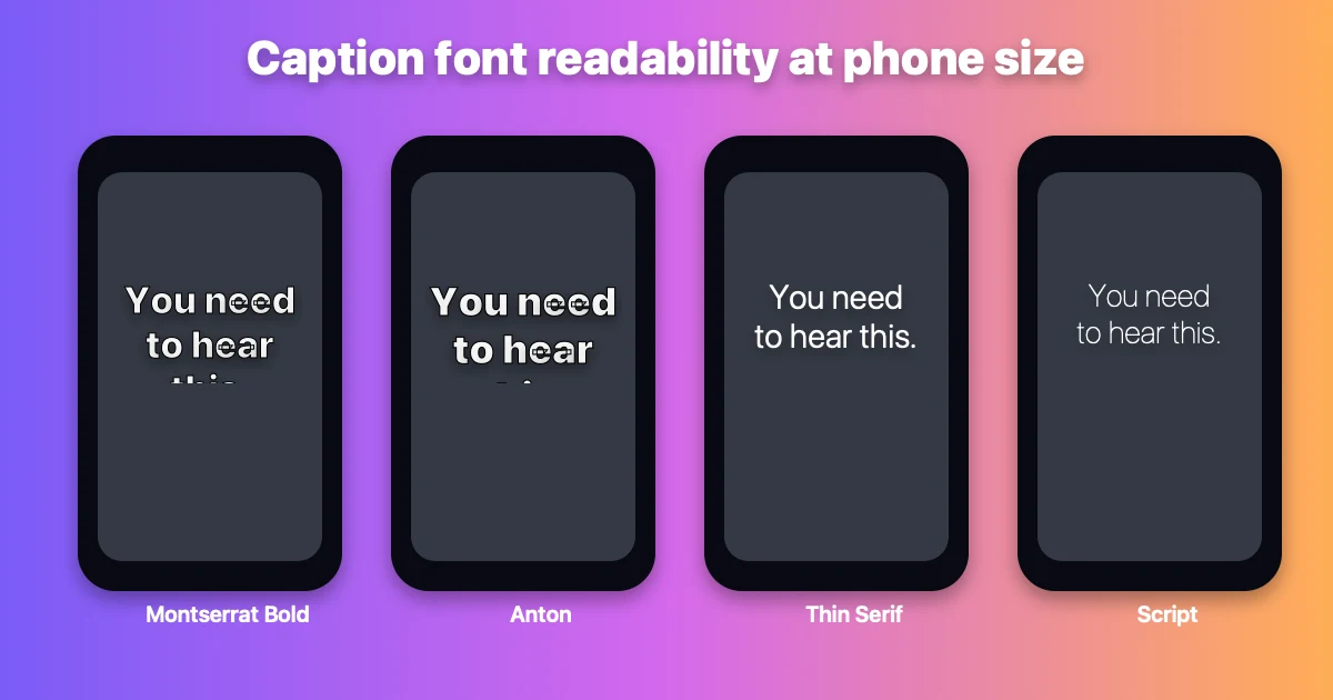
Same caption, four fonts, rendered at actual mobile size. Bold sans-serif is readable at a glance. Thin or decorative fonts require effort.
Try it yourself: preview your own caption text in every font from this guide with our free Caption Font Previewer.
Why Font Choice Affects Reel Performance
Caption font is not a cosmetic decision. It directly affects completion rate — the primary metric the Instagram Reels algorithm uses to decide how far to distribute your content.
A font that requires effort to read gives the viewer a reason to stop and swipe. A font that reads instantly keeps them moving through your content.
On Reels specifically, three conditions make font choice critical:
Sound-off viewing is the default. 85% of Instagram video is watched without sound. Captions carry the entire message. If the font is hard to read, the message is lost.
Viewers are scrolling, not studying. Reading time per caption is 1–3 seconds. The font must deliver the word before the viewer decides to scroll.
Mobile screens are small and variable. A 6-inch screen in bright sunlight or at arm's length is a hostile reading environment. Thin strokes, low contrast, and decorative letterforms disappear.
Best Fonts for Instagram Reels Captions
1. Montserrat Bold — Best All-Around
Montserrat Bold is the most widely recommended font for Reels captions in 2026. It has wide letterforms, consistent stroke width, and high x-height — all characteristics that improve readability at small sizes on bright mobile screens.
Why it works:
- Geometric structure reads instantly at any size
- Bold weight maintains visibility on complex video backgrounds
- Clean, modern look that fits most content categories
Best for: Educational content, tutorials, talking-head Reels, lifestyle content
Pair with: White fill + thin black stroke, or white fill + drop shadow
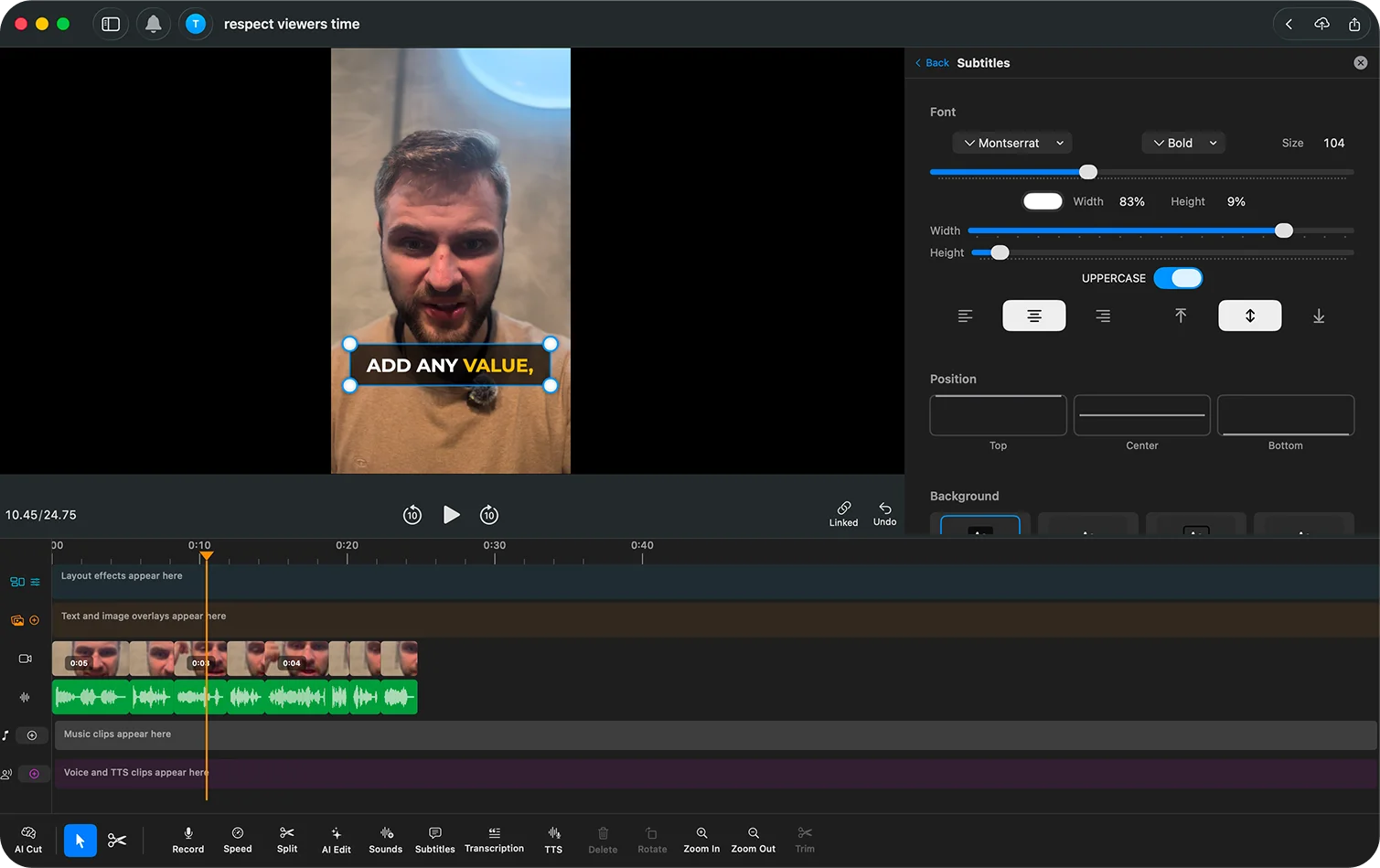
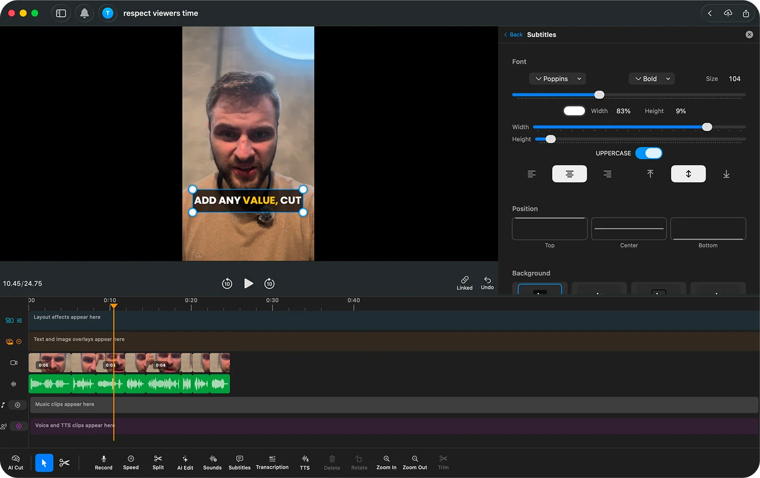
Montserrat Bold in BlitzCut's desktop editor: thick enough for messy footage, but still neutral enough for education, tutorials, and talking-head clips.
2. Anton — Best for High-Energy Content
Anton is a condensed, ultra-bold sans-serif. It takes up less horizontal space than Montserrat while remaining highly readable, making it useful when captions are long and horizontal space is limited in the 9:16 frame.
Why it works:
- Ultra-heavy weight creates maximum contrast
- Condensed width fits more text without wrapping
- Strong, assertive look matches fast-paced Reels
Best for: Fitness content, motivational Reels, quick-tip videos, anything with high energy
Avoid: Nuanced or calm content — Anton reads as loud
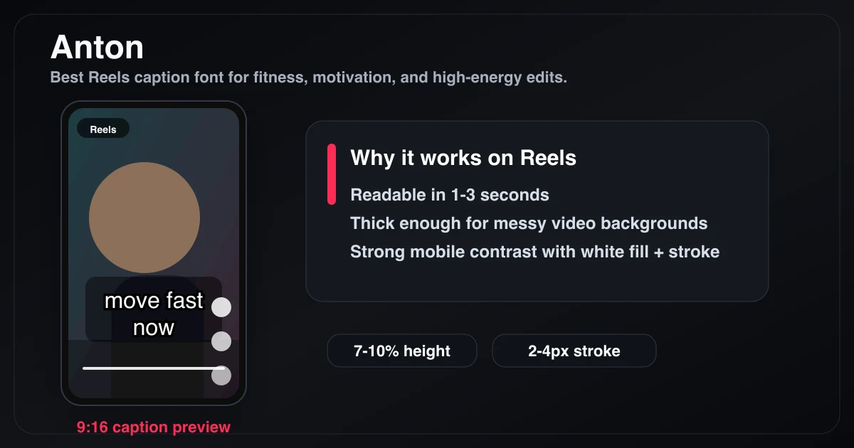
Anton compresses wide words into a tighter line and reads loud, which is why it fits fitness, motivation, and fast-paced Reels.
3. League Spartan — Best for Polished Brands
League Spartan is a geometric sans-serif with slightly more personality than Montserrat. The heavy weight variant reads clearly on mobile and gives captions a more intentional, designed look.
Why it works:
- Geometric forms read clearly at small sizes
- More distinctive than generic system fonts
- Works well with mixed-case (title case and sentence case both read well)
Best for: Branded content, business Reels, creator brands with consistent visual identity
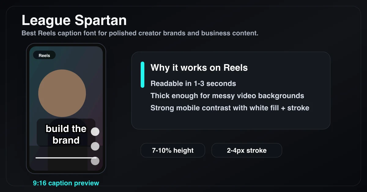
League Spartan is the least familiar font in this list, but it earns the spot: bold, geometric, and more branded than a generic system font.
4. Poppins Bold — Best for Friendly/Approachable Content
Poppins is a rounded geometric sans-serif. The rounded terminals make it feel softer and more approachable than Anton or Montserrat.
Why it works:
- Rounded forms feel warm, not aggressive
- Bold weight maintains readability
- Works at both large and smaller caption sizes
Best for: Lifestyle content, wellness, beauty, parenting, any category where warmth matters more than authority
Poppins Bold in BlitzCut's desktop editor: readable, rounded, and softer than Anton or Montserrat for lifestyle and wellness content.
5. Open Sans Bold — Best Accessible Option
Open Sans was designed specifically for screen readability. It's neutral, highly legible, and renders well across devices and screen densities. Less distinctive visually, but reliable.
Best for: Accessibility-first content, educational content with complex information, any situation where clarity beats personality
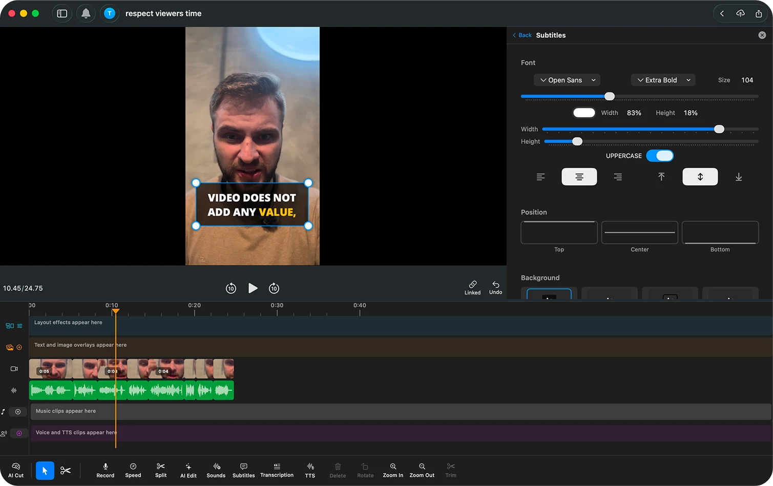
Open Sans Extra Bold in BlitzCut — neutral, readable, and built for accessibility-first Reels.
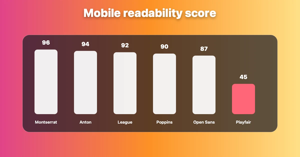
Font readability ranked by mobile legibility at actual Reels display size. Bold sans-serif fonts consistently score highest.
Fonts That Don't Work on Reels
Thin and Light Weights
Any font in Light, Thin, or Extra-Light weight fails on Reels. Thin strokes disappear on video backgrounds, especially on screens in bright environments or at arm's length.
Avoid: Helvetica Neue Light, Roboto Thin, Gill Sans Light
Decorative and Script Fonts
Script and handwriting fonts have variable stroke width and low legibility at small sizes. They require effort to read — which means scroll risk.
Avoid: Pacifico, Dancing Script, Lobster, any cursive or handwriting font
Serif Fonts
Serif fonts (Times, Georgia, Playfair Display) are designed for long reading in print. The serifs (small decorative strokes on letterforms) create visual noise on video backgrounds and reduce readability at small mobile sizes.
Avoid: Playfair Display, Garamond, Times New Roman, Merriweather — for captions. Serif fonts can work in static overlay text at large sizes, not in caption streams.
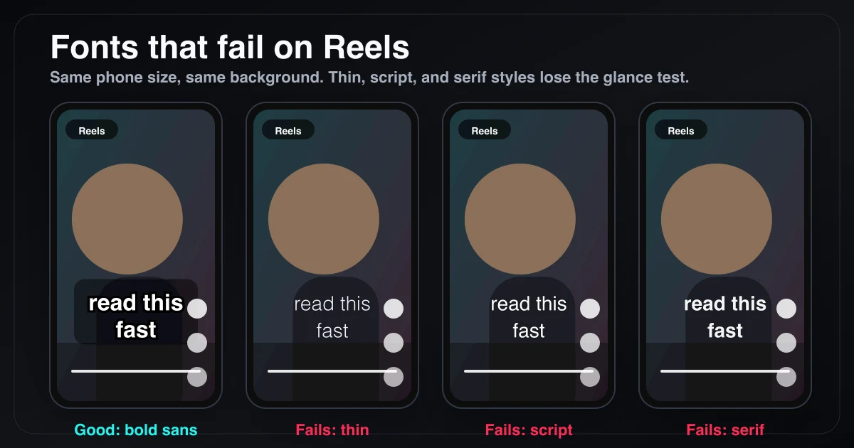
This is the same caption at the same mobile size. Thin, script, and serif fonts require more effort than a bold sans-serif, which is exactly the problem in a fast-scrolling Reels feed.
Font Size: What the Industry Uses
Font size for Reels captions is typically expressed as a percentage of frame height (since Reels is always 9:16 but displays at different physical sizes). Industry standards from broadcast guidelines:
- BBC subtitle standard: Font covers approximately 8% of frame height
- Netflix standard: Maximum 42 characters per line, sized so text fills roughly the bottom fifth of the frame
- Social media sweet spot: 7–10% of frame height for caption text on Reels
At 1080×1920 pixels (standard Reels resolution), 8% of frame height = approximately 154px. In most editing apps, this translates to a font size between 52–72pt depending on the font's design.
Practical guide:
- Too small (under 5% frame height): viewers have to squint
- Too large (over 12% frame height): covers the video and reads as aggressive
- Sweet spot: 7–10% of frame height, enough to read instantly
Pairing Your Font with Background Treatment
Font choice is only half the readability equation. The treatment behind the text — shadow, outline, or background box — determines whether the font stays readable as the video background changes.
| Treatment | Readability | Visual Intrusiveness |
|---|---|---|
| Solid background box | Highest | Highest |
| Text stroke/outline | High | Medium |
| Drop shadow | Medium | Low |
| Font alone (no treatment) | Low-Medium | None |
For bold sans-serif fonts on Reels: a thin 2–4px black stroke (outline) is usually enough. Avoid relying on drop shadow alone — it fails on light video backgrounds.
Full guide: Caption Background vs Outline vs Shadow: Which Is More Readable
What BlitzCut's Caption Styles Use
BlitzCut generates AI captions with pre-built styles optimized specifically for Instagram Reels. The styles ship with:
- Bold sans-serif fonts (Montserrat-class weight and geometry)
- White fill with stroke for dark-background readability
- Pre-sized at the Reels sweet spot (7–9% frame height)
- Word-by-word highlight option for animated karaoke style
No manual font selection, no sizing math. Import, tap Subtitles, choose a style, export.
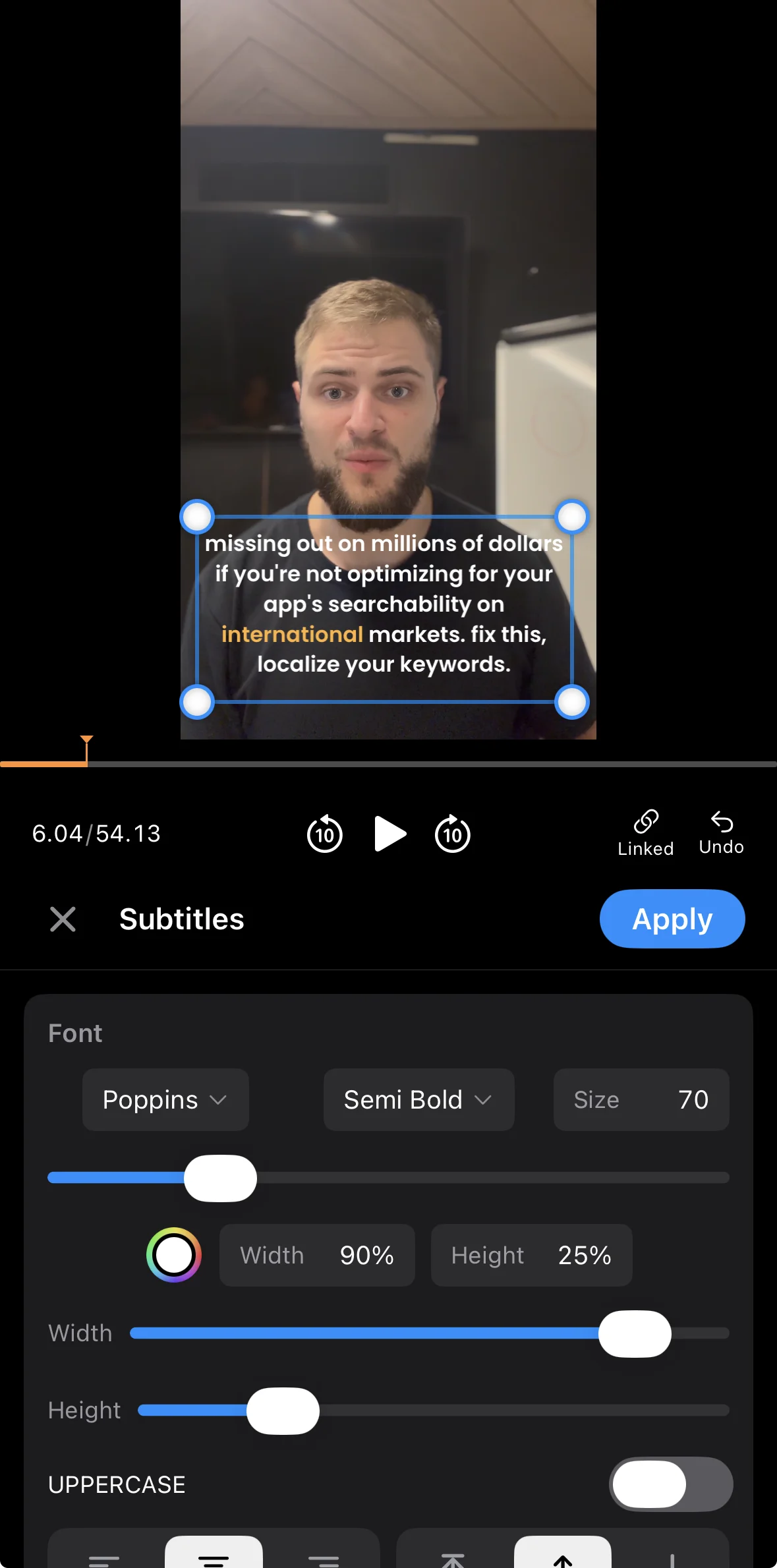
BlitzCut's mobile subtitle controls expose the exact caption settings creators adjust for Reels: font, weight, size, width, height, case, and position.
Font Choice by Content Category
| Content Type | Recommended Font | Why |
|---|---|---|
| Educational / Tutorial | Montserrat Bold or Open Sans Bold | Clarity over personality |
| Fitness / Motivation | Anton | Bold, energetic, reads loud |
| Beauty / Lifestyle | Poppins Bold | Warm, approachable, clean |
| Business / Brand | League Spartan | Distinctive without being aggressive |
| Entertainment / Humor | Montserrat Bold or Anton | Fast reads match fast pacing |
| Wellness / Mindfulness | Poppins Bold | Soft geometry matches calm tone |
Frequently Asked Questions
What is the best font for Instagram Reels captions?
Montserrat Bold is the most versatile choice for Instagram Reels captions in 2026. Anton works better for high-energy content. Both are bold sans-serif fonts that read clearly on mobile at the standard Reels caption size.
What fonts does CapCut use for Reels captions?
CapCut's default caption styles use bold sans-serif typefaces similar to Montserrat and Anton. The "Reels" and "Trendy" presets in CapCut use condensed bold fonts with white fill and a thin stroke or background treatment for readability.
How big should Instagram Reels caption text be?
7–10% of the frame height. At 1080×1920 resolution, this is approximately 52–72pt depending on the font. Text below 5% of frame height requires squinting on mobile. Text above 12% covers too much of the video.
Should Instagram Reels captions be uppercase or sentence case?
Both work, but all-caps in bold sans-serif (like Anton) is a popular style for high-energy Reels because it reads faster. Sentence case (Montserrat, Poppins) reads more naturally for longer captions and educational content. Avoid title case for captions — uneven capitalization creates visual noise at speed.
Do caption fonts affect the Instagram algorithm?
Indirectly, yes. Readable captions keep muted viewers watching, which increases completion rate — a primary Reels ranking signal. The specific font doesn't affect the algorithm directly, but fonts that improve readability improve the engagement signals the algorithm measures.
Related Guides
- Caption Background vs Outline vs Shadow: Which Is More Readable — treatment comparison
- Best Caption Style for YouTube Shorts (2026) — Shorts-specific guide
- Best Caption Colors for TikTok — color strategy
- Best Caption Size for TikTok (2026) — sizing guide
- Word-by-Word vs Full-Sentence Captions — format comparison
- Add Captions to Instagram Reels Automatically — setup guide
Post every day without spending hours editing
BlitzCut is a native App Store app for iPhone, iPad and on Mac. Get from raw footage to TikTok-ready in under 2 minutes, so editing is never the reason you didn't post.
Download BlitzCut on the App StoreRelated Articles
Keep Reading

Best Podcast Clip Makers in 2026 (Honest Comparison)
The best podcast clip makers compared: Opus Clip, Vizard, Riverside, Descript, and BlitzCut — ranked by how you actually clip, with real tradeoffs and pricing.

Best Teleprompter Apps for iPhone in 2026 (Tested)
The best teleprompter apps for iPhone: Teleprompter Premium, PromptSmart Pro, BIGVU, and free options compared — plus the editing step that makes prompter footage watchable.

How to Edit a VSL That Converts (2026 Guide)
How to edit a video sales letter: cut dead air, tighten the script after recording, add captions for muted autoplay, and pace the pitch — with the exact workflow.